Web Design
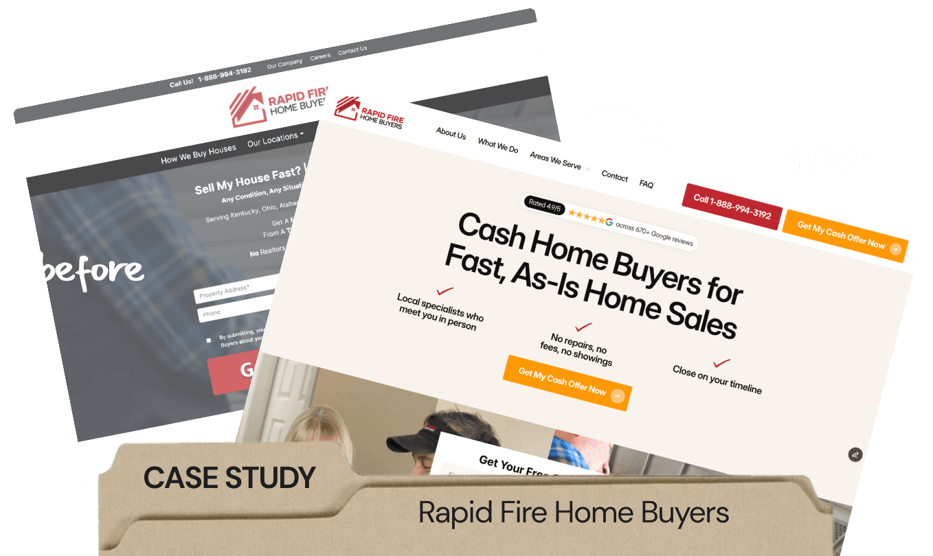
Case Study: Turning A Generic Handyman Site Into A Lead-Generating Machine

Ineke van Wyk
Dec 26, 2025

Most companies don’t struggle because they do bad work. They struggle because their websites don’t show it.
HandymanCo was one of them.
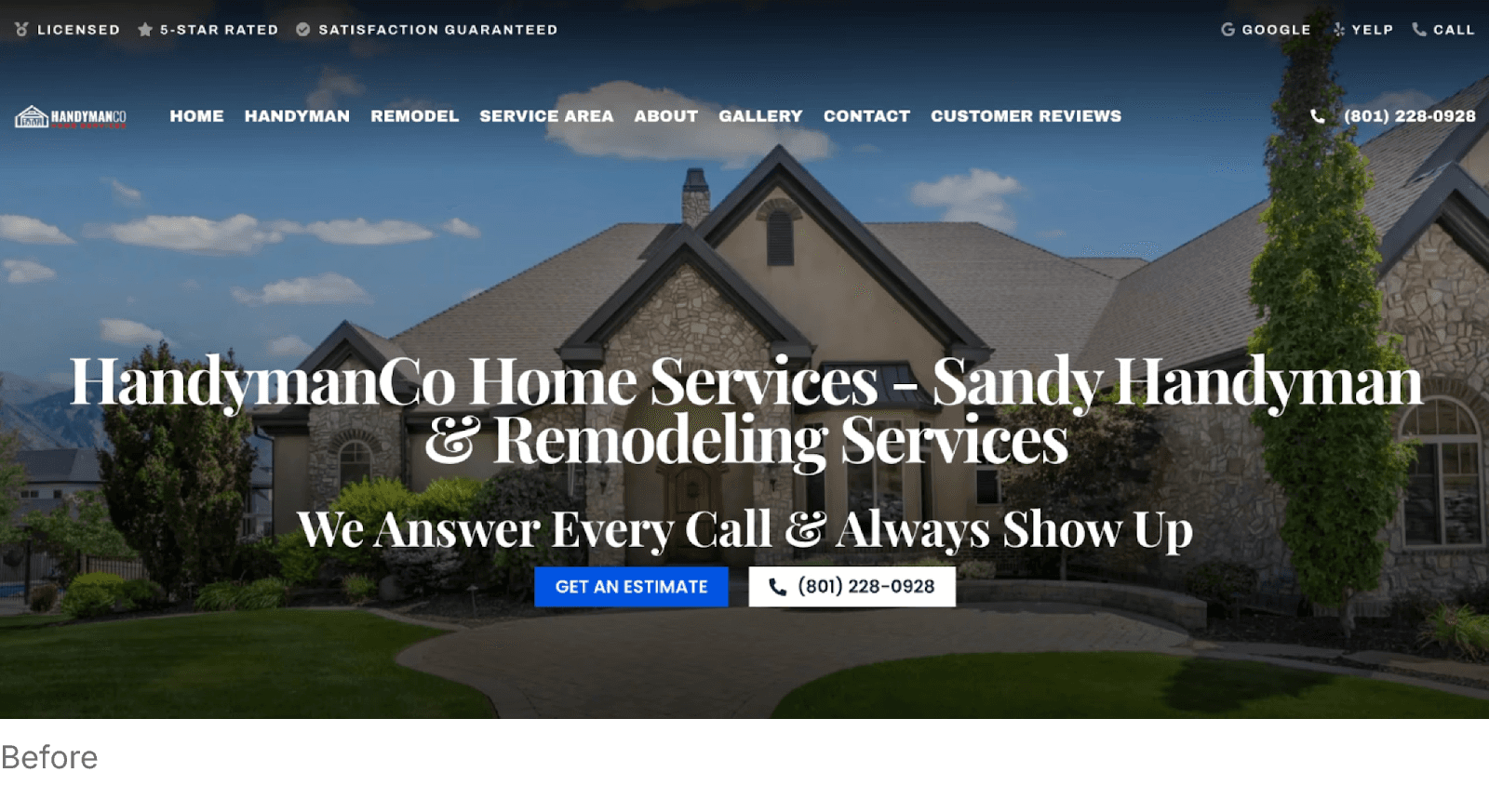
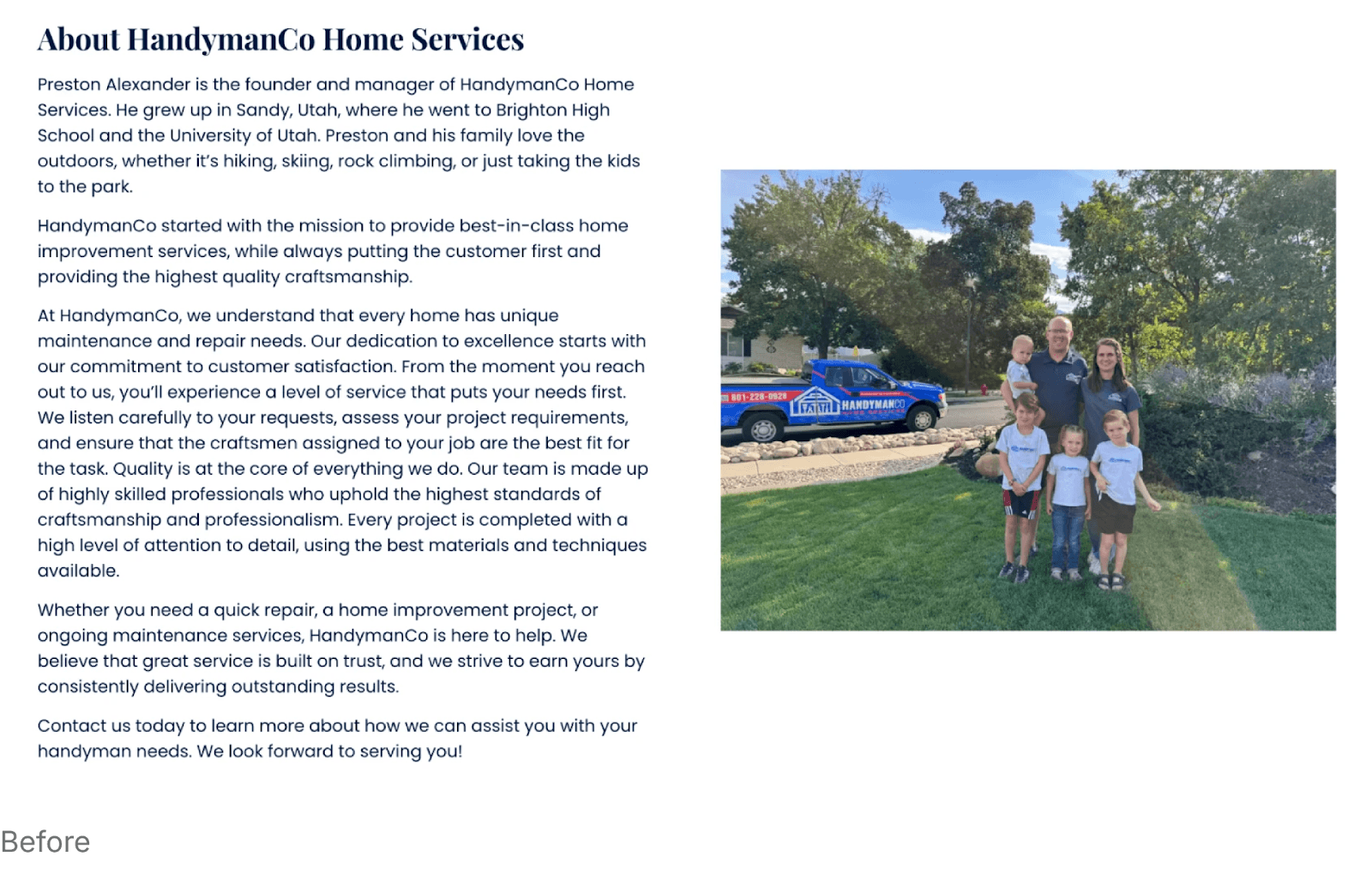
Their old site looked like a template: dated fonts, muted visuals, and long paragraphs that buried what they actually did. None of it matched their trucks, uniforms, or the solid craftsmanship they’re known for.
We rebuilt everything – design, structure, and proof – to give HandymanCo a site that finally looks as trustworthy and hardworking as the team behind it.
Here’s how we did it.
Key Notes
A strong hero section with human presence and proof elements boosts conversions within seconds.
The AIDA framework creates a smooth, high-converting user flow from attention to action.
Service-specific pages expand SEO visibility and establish authority across multiple search categories.
Rebuilding the Foundation With Brand Alignment
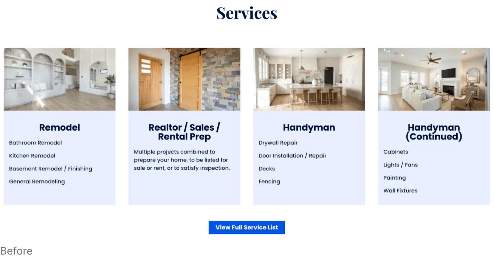
The old HandymanCo site used a serif font and neutral color palette – more suited to a law firm or coffee-table magazine than a handyman service.
What We Changed
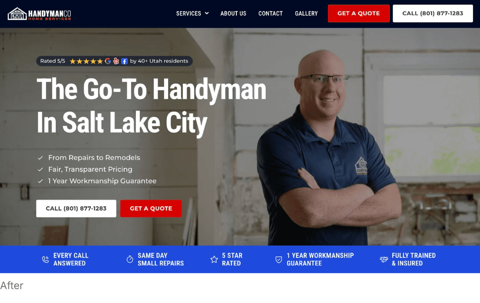
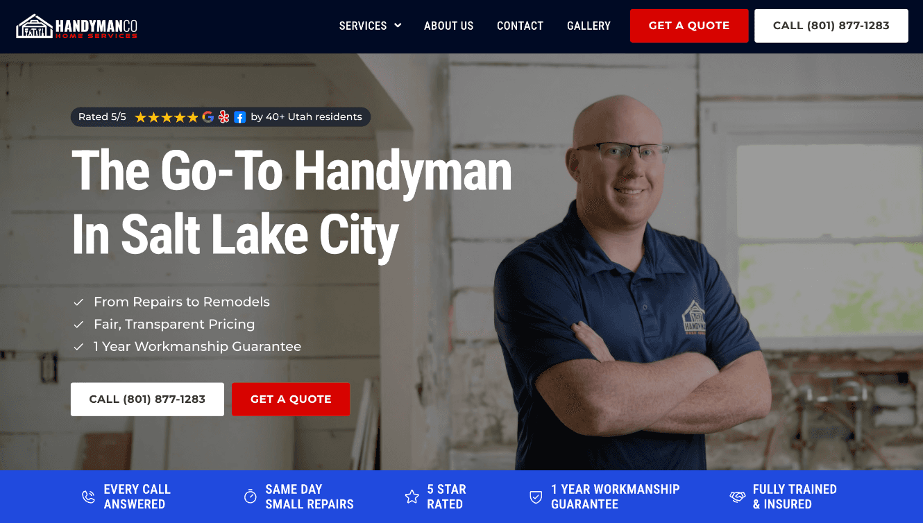
Switched to a clean, modern sans-serif font that conveys clarity and reliability.
Leaned fully into their existing brand colors – blue, red, and navy – the same colors used on their logo, work uniforms, and service truck.
Introduced stronger visual hierarchy and spacing to give the site a polished, confident look.
Why It Mattered
When customers visit the site, they should instantly feel like they’re interacting with the same company that shows up at their door. The redesign finally united HandymanCo’s offline and online identity – building recognition, trust, and consistency across every touchpoint.
A Hero Section That Establishes Trust in 3 Seconds
The previous hero section was text-heavy and impersonal. No face. No credibility. No instant takeaway.
Our Redesign Focused On:
Adding a photo of one of the company’s co-owners – in uniform – to humanize the brand and prove legitimacy.
Displaying Google review ratings immediately for instant authority.
Highlighting clear, benefit-driven selling points (fast response, reliability, experience).
Using a headline that speaks directly to their audience’s state of mind.
Why It Worked
Homeowners searching for a handyman are often stressed, rushed, and unsure who they can trust.
A strong hero section answers their biggest questions before they even scroll: “Is this company real? Can they help me? Have others trusted them?”
This one change alone dramatically improves conversions.
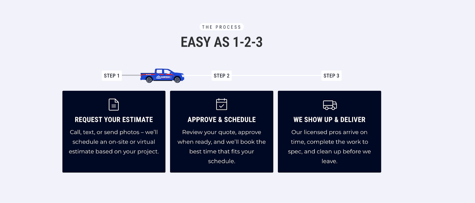
Using the AIDA Framework to Create a Smooth, High-Converting Flow
The previous site had useful content, but the order was off. Important credibility pieces were buried, while dense text took up valuable space near the top.
We rebuilt the page using the AIDA framework:
A – Attention
A strong hero section with a real person, bold messaging, and proof badges.
I – Interest
A simple step-by-step process to illustrate how easy it is to resolve a potential client’s need, as well as a clean visual layout of services, clear categories, and an at-a-glance understanding of what they fix, repair, and install.
D – Desire
Multiple forms of social proof:
Photo testimonials
Written reviews
Before-and-after visuals
Video testimonials for maximum persuasion

A – Action
Clear call-to-action buttons placed intentionally:
At the top
After the services list
After the portfolio
Inside the FAQs
Call to action banner at the bottom of the page before the footer

This path guides visitors naturally toward booking without overwhelming them.
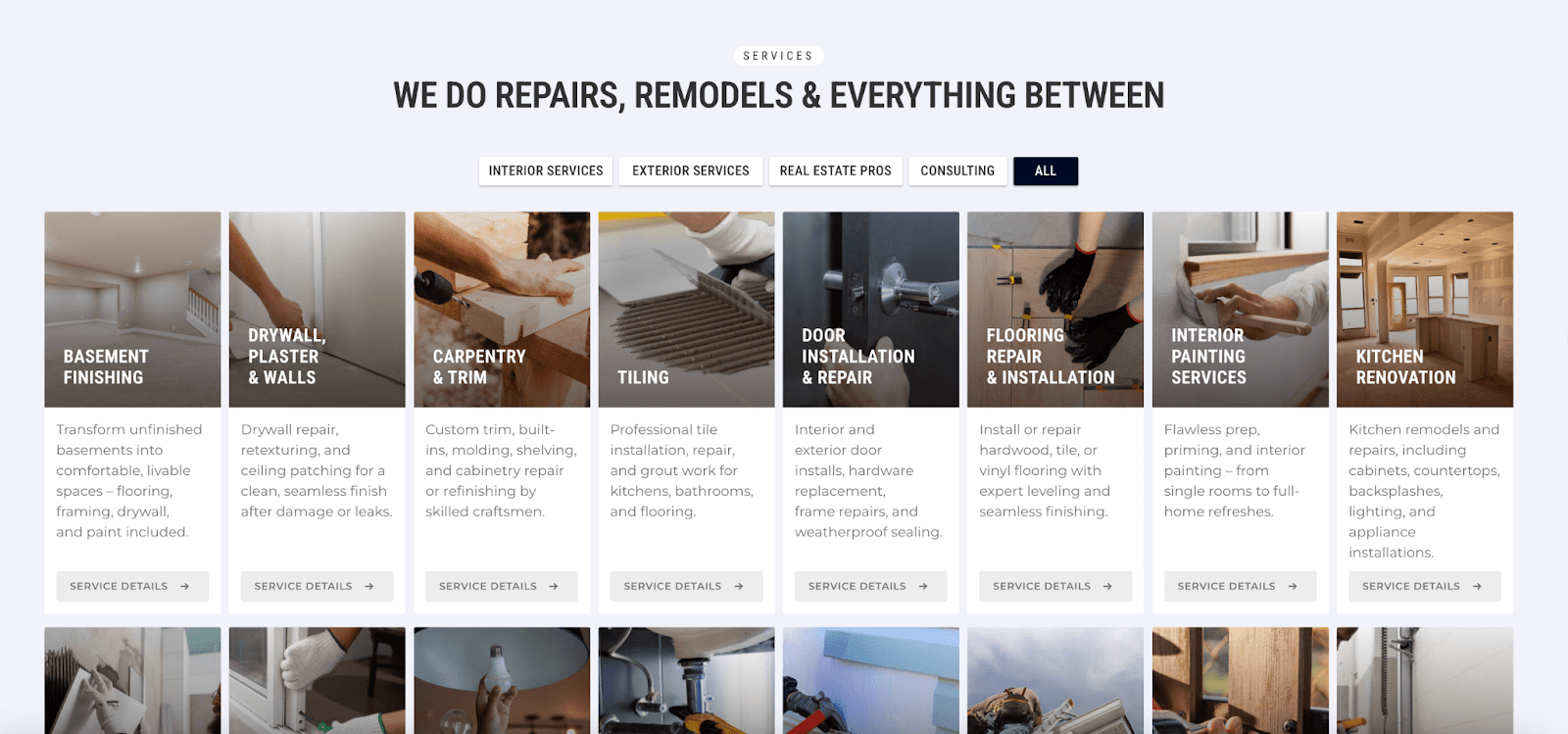
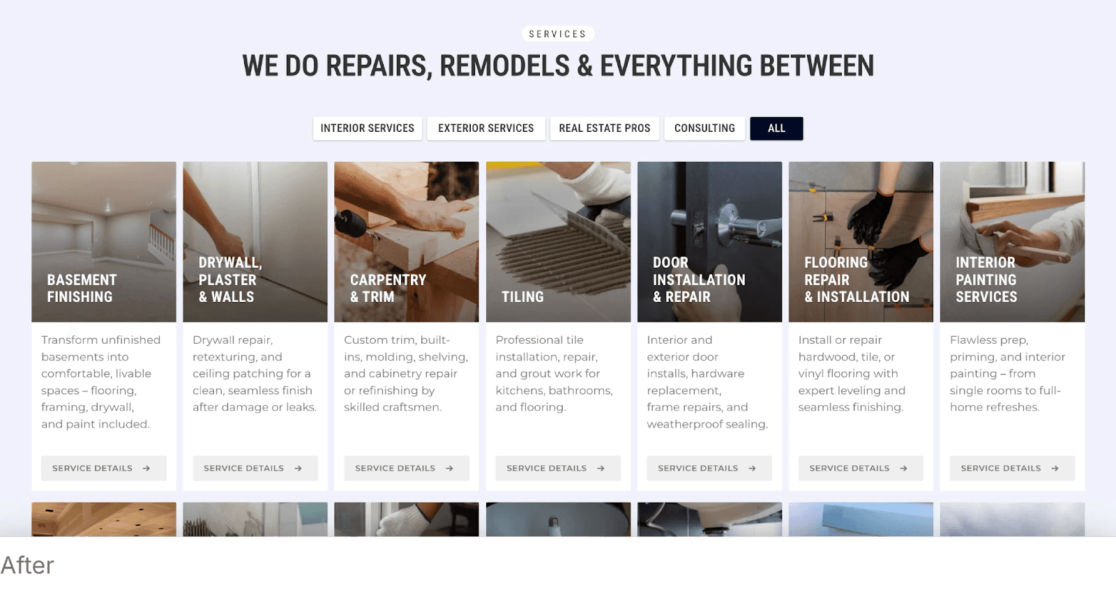
Expanding the Services Section (20+ Pages for SEO & Authority)
The old site mentioned services, but didn’t give each one the spotlight it deserved.
What We Created
A visual services grid that makes it effortless to understand what HandymanCo offers.
20+ individual service pages, each optimized for SEO keywords, local rankings, and service-specific credibility.
Why This Matters
Handyman customers rarely search for “handyman near me.”
They search for:
“door repair salt lake city”
“drywall patch handyman”
“ceiling fan installation near me”
“tile repair service SLC”
Each service page becomes a landing page – both for Google AND for customers scanning to see if HandymanCo handles their issue.
This one upgrade alone increases organic visibility and positions the company as established and specialized, not a one-size-fits-all contractor.
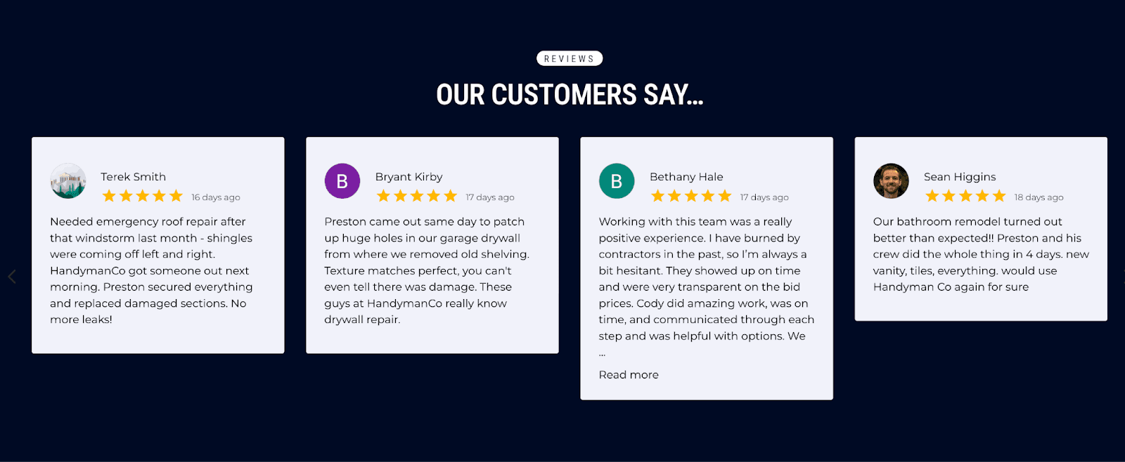
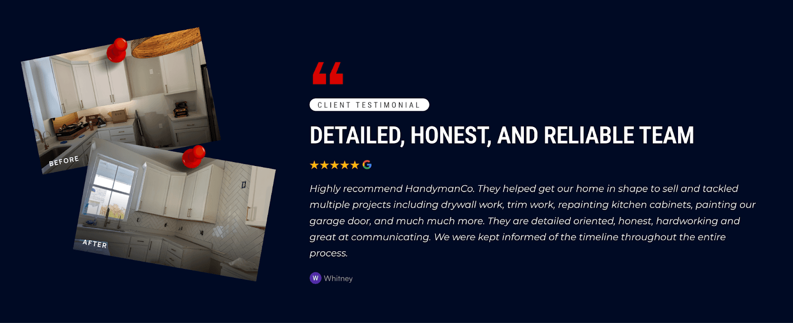
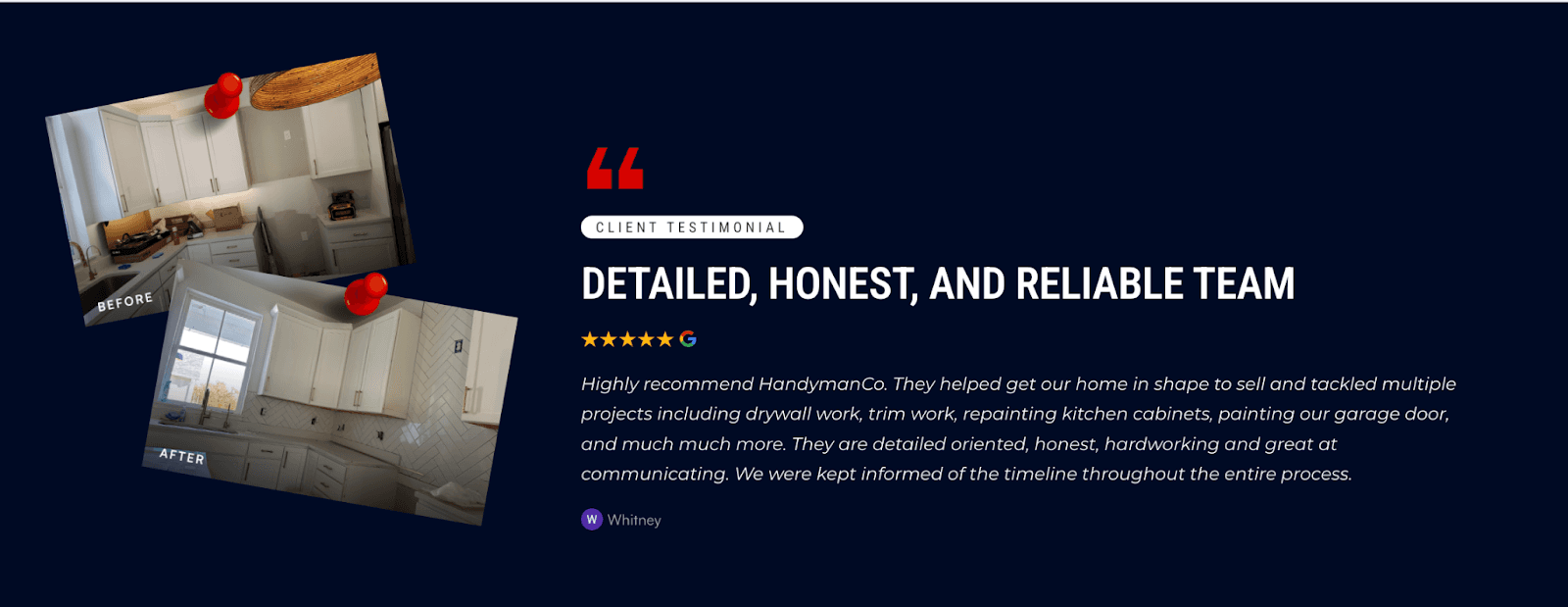
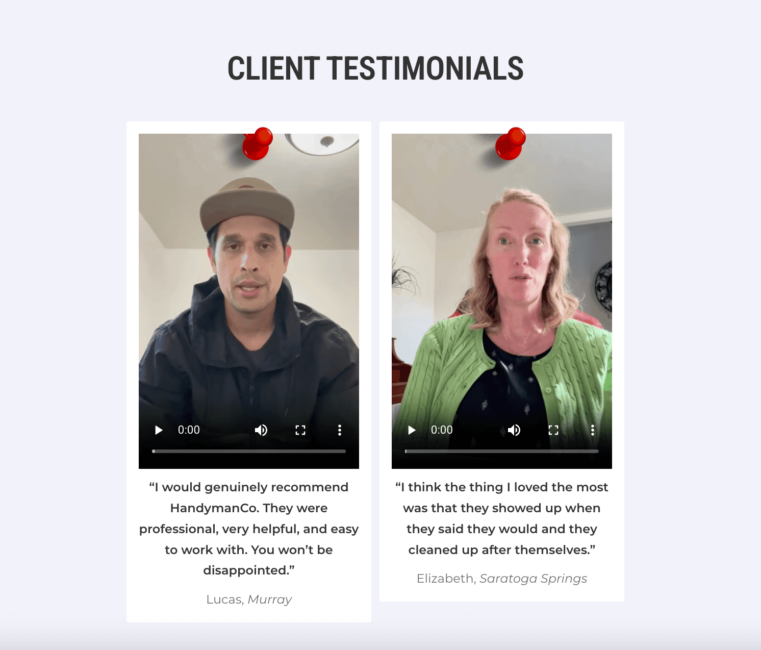
Turning Social Proof Into a Sales Tool
The old site included testimonials, but they were small and got lost in the layout.
What We Added
A section of client video testimonials (high trust)
Before-and-after project galleries
Before-and-after video transformations
Google review highlights
Client photos to add authenticity
Visual proof transforms skepticism into confidence – especially with home repairs where trust matters more than price.
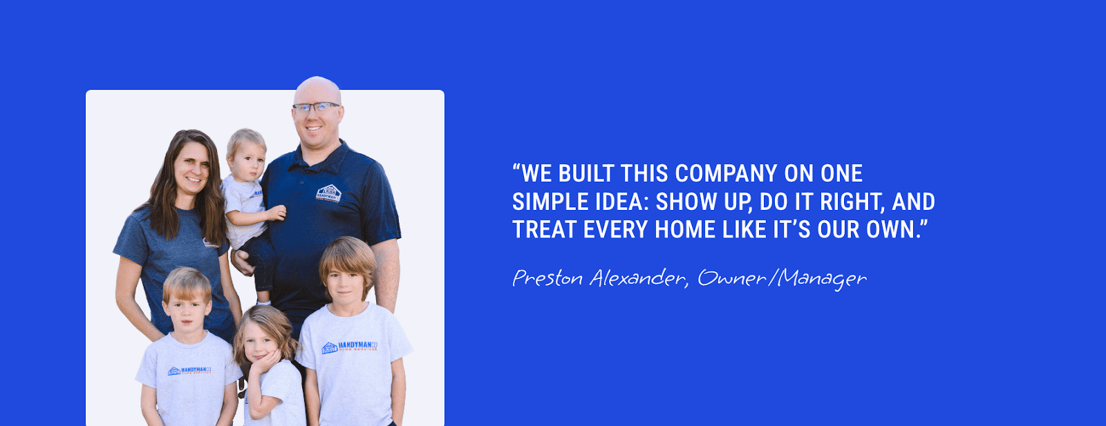
Reworking the About Section to Build Trust Sooner
On the original website, the About section was:
Too far down the page
Far too text-heavy
Easy to miss
The Fix
We moved the About section higher and drastically simplified the content. Instead of paragraphs, we broke the story into:
A short, relatable introduction
Quick bullet points
A photo of the team
This gives visitors what they actually want: “Who’s coming into my home, and can I trust them?”
Reducing Text Bloat for a Faster Decision Process
Handyman customers are typically in a pinch – broken faucet, damaged wall, something urgent. They don’t have time to read essays.
We Removed:
Long paragraphs
Redundant explanations
Content that slowed down the user journey
We Added:
Bite-sized, scannable sections
Clear icons and visuals
Short descriptions for every service
This aligns with modern user behavior: people scan first, then read if interested.
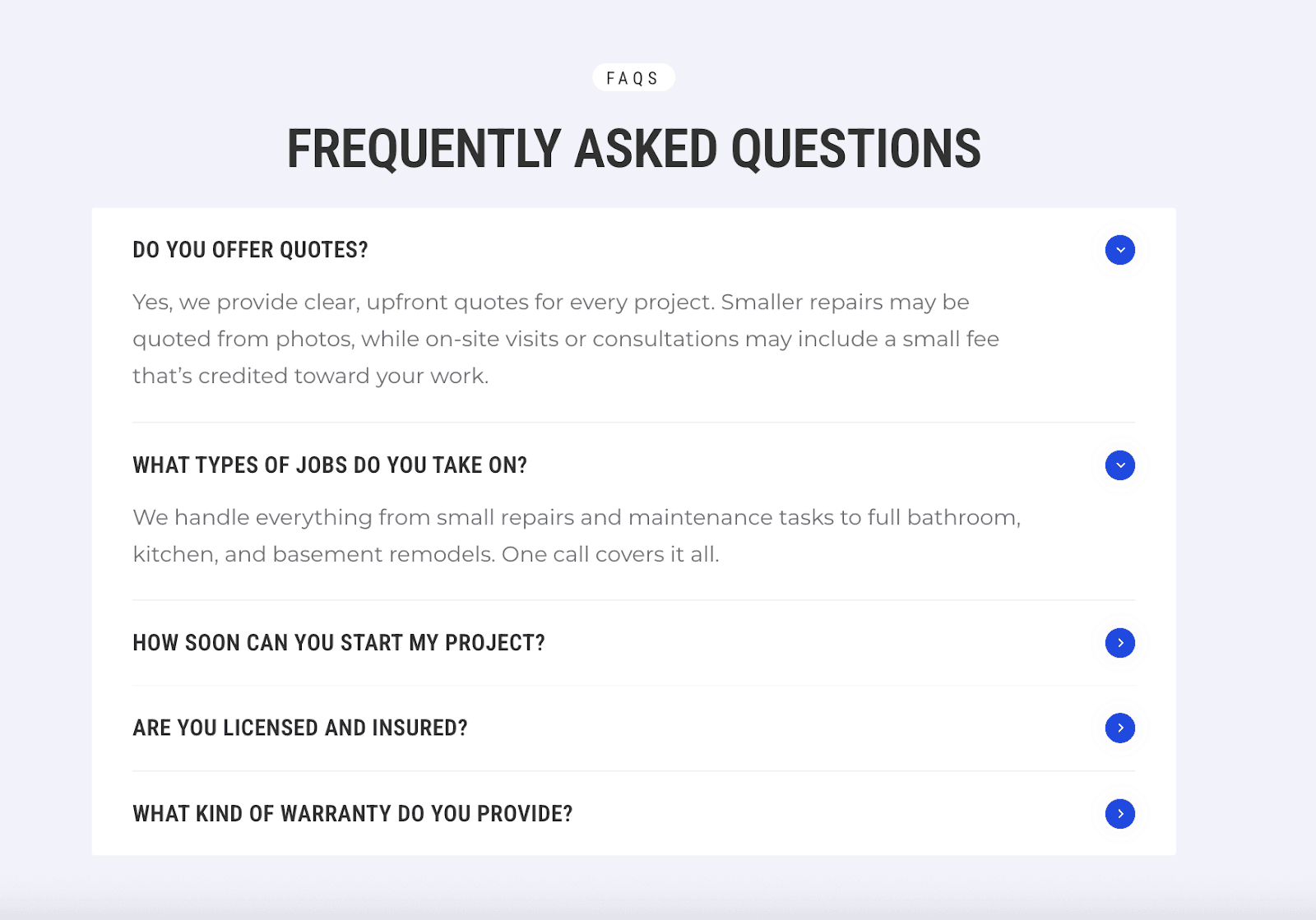
Adding FAQs for SEO + Objection Handling
FAQs serve two important jobs:
Rank for long-tail “how much / how long / do you fix X?” queries
Address hesitations that prevent someone from calling
We crafted FAQs that directly answer common handyman doubts:
pricing expectations
timelines
service areas
what’s included
how booking works
This improves conversions, reduces customer confusion, and boosts Google rankings simultaneously.
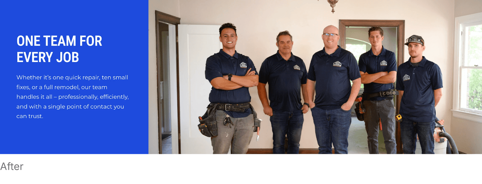
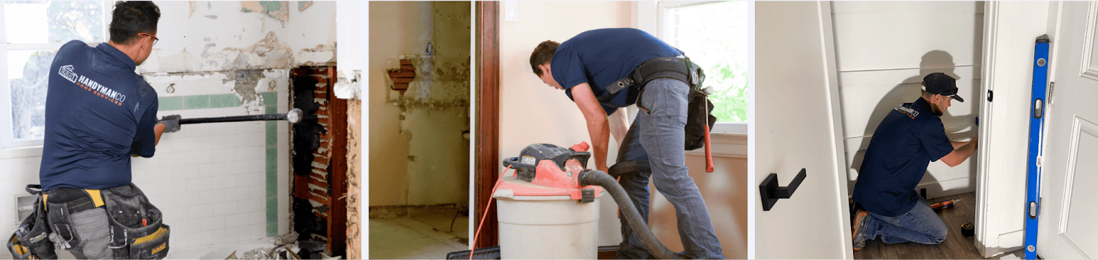
A Website That Looks Like a Real Handyman Company
The updated design incorporates:
Real project photos
Action shots of the team
Tools, materials, and workshop lifestyle visuals
Colors that match the real-world brand
The old site looked like a template. The new site looks like HandymanCo.
That difference changes everything.
The Outcome
With the redesign, HandymanCo now has a website that:
Builds trust instantly
Shows real people and real work
Matches their trucks, uniforms, and branding
Follows the AIDA structure to convert more leads
Expands their SEO footprint with 20+ service pages
Gives visitors exactly what they need – quickly
Most importantly, the new site feels alive – not like a generic handyman template. It feels like a company you’d open your door to.
Want This Level of Website Transformation for Your Contracting Business?
Rainmaker Remodel specializes in high-converting websites for remodelers, GCs, handyman companies, and specialty trades.
If you want a:
website that’s built for speed, conversions, and SEO
brand that feels trustworthy and professional
visual identity that finally matches the quality of your work
Then you’re exactly who we help.
Book a free consultation – we’ll show you how to turn it into a lead-generating machine.