Web Design
12 Must-Have Sections For Contractor Websites To Generate More Leads

Ineke van Wyk
Dec 3, 2025

Design isn’t just about how your website looks. It’s about how it makes people act. Every layout choice, color, and section plays a role in whether a visitor clicks, calls, or bounces.
At Rainmaker Remodel, we design websites that convert visitors into leads by focusing on structure, usability, and persuasive visuals.
Here’s a breakdown of the core sections every high-converting website needs (with real examples from our past projects).
Key Notes
A strong hero section with clear CTA and social proof drives first-click conversions.
Sticky navigation and trust badges improve usability and reinforce professionalism.
Grid-based service and social proof sections boost both SEO and credibility.
Case studies, owner quotes, and FAQs reduce hesitation and turn visitors into leads.
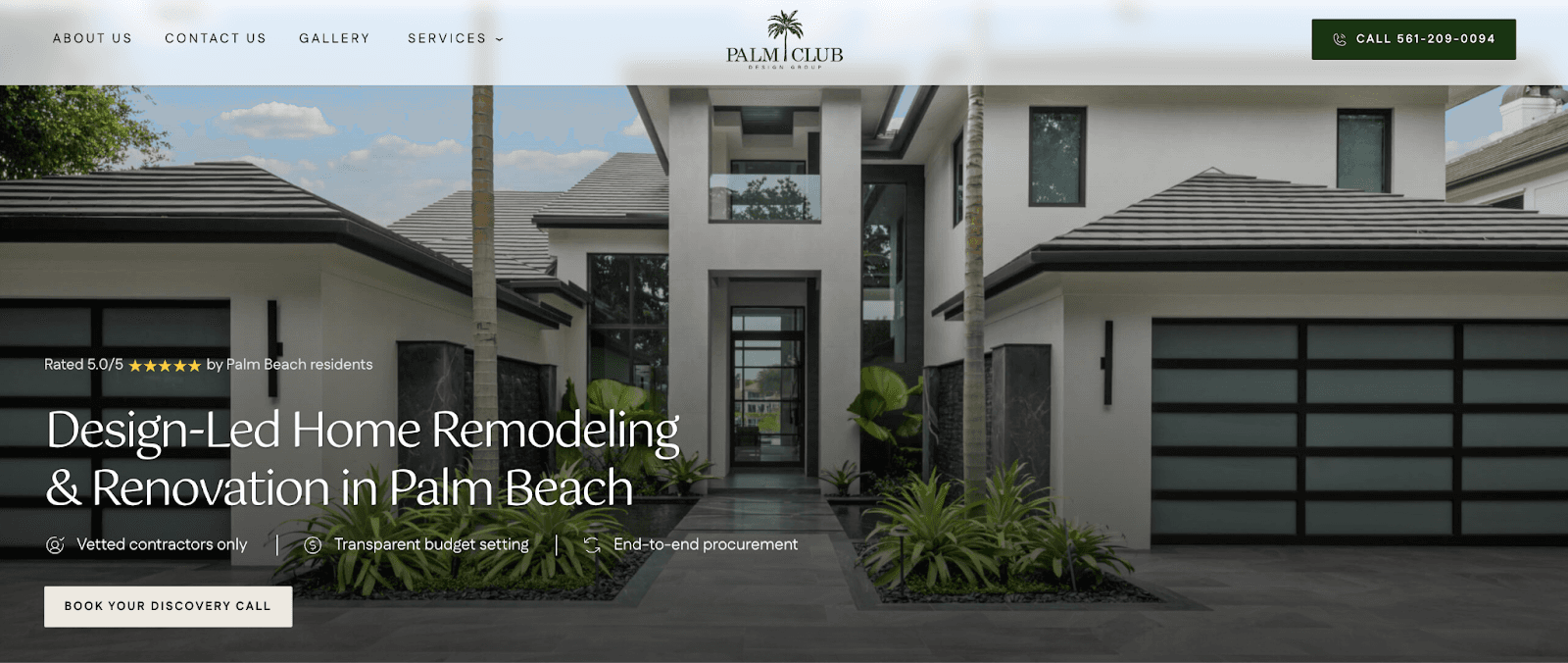
The Hero Section – Your First Impression Matters Most
Your hero section is the most valuable real estate on your website. It’s where first impressions form and conversions begin.
A strong hero section strikes a balance between information and impact: clear copy, engaging visuals, and immediate action.
What To Include:
Captivating headline. This is often your main value proposition. State exactly what you do and establish authority (e.g., “Charlotte’s #1 Flooring Experts”).
Social proof. Show off your Google rating with five stars, the number of reviews, and even where reviewers are located. This creates familiarity and trust, especially when potential customers see people nearby praising your service.
Supporting visuals. Use authentic images or videos that reflect your service and brand tone.
USPs (Unique Selling Points). Add short, scannable bullet points that quickly show what makes you different – these should contain keywords and proof-driven language.
Clear call-to-action (CTA). A button that stands out. If your brand colors are similar, introduce a dedicated accent color for CTAs only. Keep your CTA visible both in your hero section and in your sticky navigation bar.

Sticky Navigation – Subtle but Essential
A sticky navigation bar keeps your main links visible as users scroll, creating a smoother and more intuitive browsing experience.
By keeping your primary call-to-action in view at all times, you make it easy for visitors to take action whenever they’re ready – no matter where they are on the page.
This constant visibility subtly encourages conversions without interrupting the user journey.
Industry Badges, Certifications & Trust Seals
Displaying industry badges and certifications instantly builds credibility. They show that your business is verified, qualified, and trusted within your field.
Badges such as licensed contractor seals, safety certifications, or association memberships reassure visitors they’re choosing professionals who meet industry standards.
Place them in high-visibility spots – like below your hero section or just above the footer – to reinforce trust without distracting from your core message.


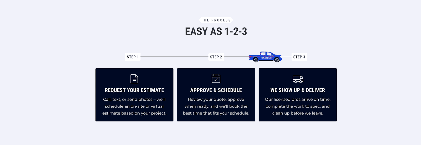
Simple “3-Step” Process Section
Directly beneath your hero, show visitors how to go from pain point to desired outcome fast. We often use a three-step format:
Contact or Request a Quote
Get a Custom Plan or Design
Enjoy the Finished Result
This instantly removes friction – users see that working with you is simple, structured, and stress-free.
About / Introductory/Information Section
After you’ve earned their attention, introduce your business more fully. Use a short H2 headline and a paragraph that expands on what you do or one of your main USPs.
The layout works best with text on the left and a visual or video on the right (stacked vertically on mobile).
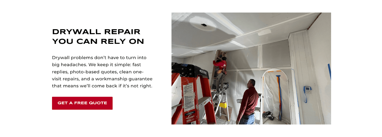
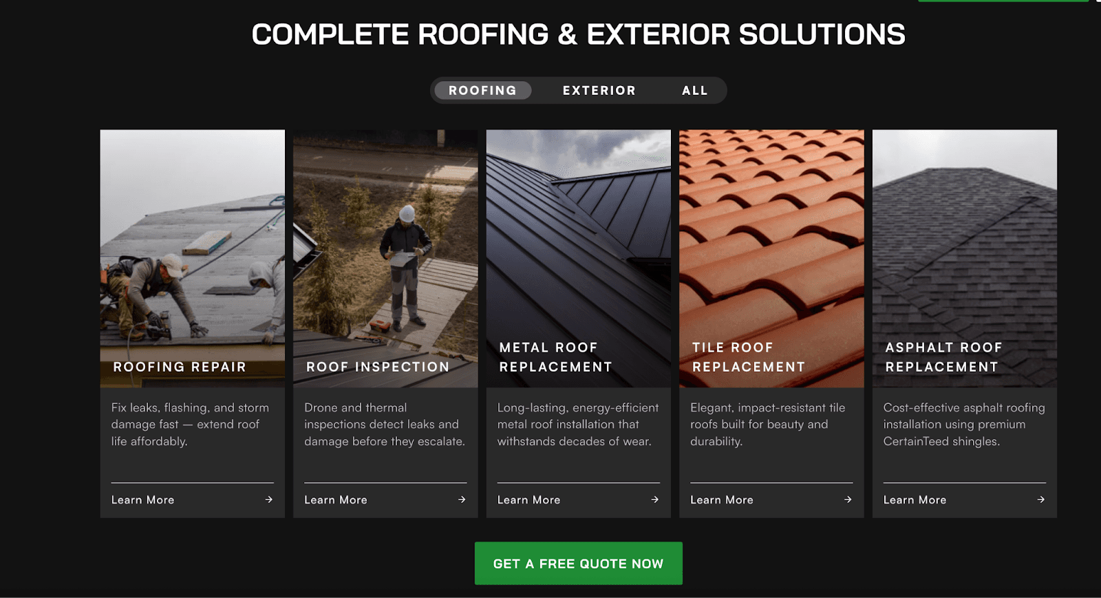
Services Section
Your services should be displayed in a clean block or grid layout for clarity and ease of navigation.
Each block should include:
Service name
Short description
Icon or image
Clickable link to a detailed service page
This structure not only helps visitors quickly find what they need but also strengthens your SEO performance. Internal linking from the homepage to your primary service pages signals their importance to search engines, helping them rank higher.
Additionally, showcasing these services directly on your homepage supports Google Business Profile (GBP) visibility when your homepage is linked as your GBP URL – improving both relevance and local ranking potential.
Using a grid layout also encourages engagement by visually distinguishing each service and clearly signaling clickability, unlike a simple bulleted list.
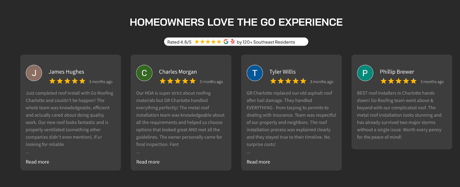
Social Proof
Nothing builds trust faster than real customer experiences. Social proof should appear throughout your website – not just in one place – as a subtle but constant reminder of your credibility.
A great example is a section with a carousel that automatically pulls new Google reviews directly onto your site. At Rainmaker Remodel, we custom-design these widgets to match your brand’s look and feel, ensuring your latest 5-star reviews are always visible.
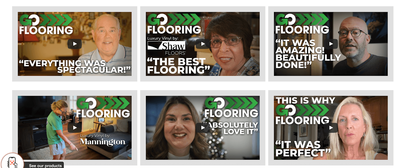
You can also feature a video testimonial section to show what real customers say about your business. Edited with short clips that include footage or photos of completed work add even more authenticity.
Real voices and visuals create instant credibility – just make sure the videos are short to avoid slowing down your website and keeping your audience’s attention.
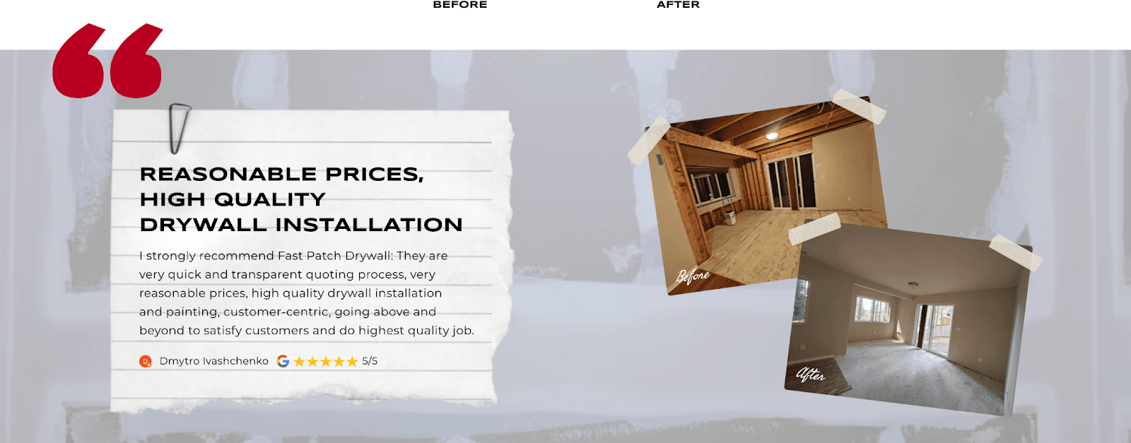
Finally, consider adding a featured review section that pairs a standout customer testimonial with project photos. This not only highlights the quality of your work but also connects positive feedback directly to a visual result – making the praise more tangible and persuasive.
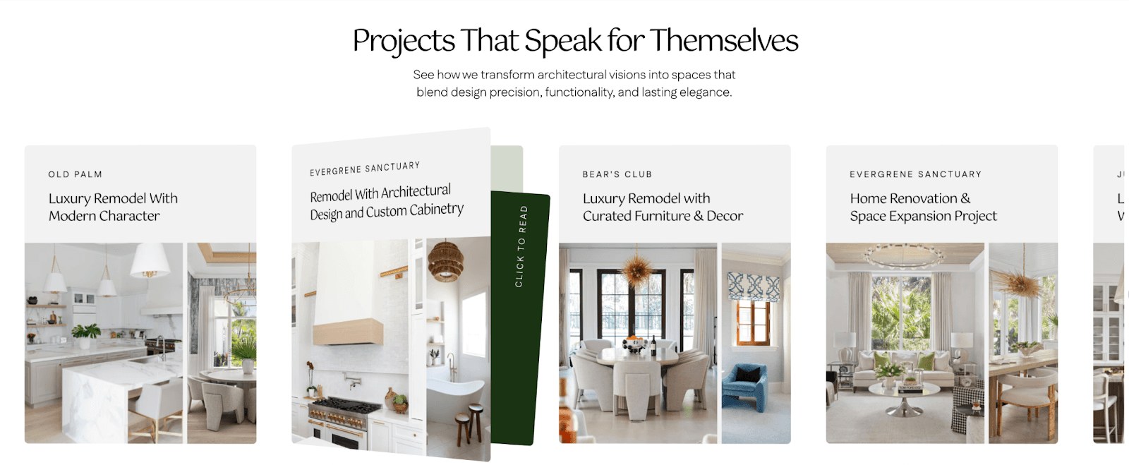
Case Studies or Project Highlights
Visual proof sells. Showcase your past work in a clean, image-forward format with brief captions explaining each project.
This helps visitors see your craftsmanship and expertise instead of just reading about it.
Before/after images that show transformation is also a visual device that is most useful to convince viewers of craftsmanship and skill.
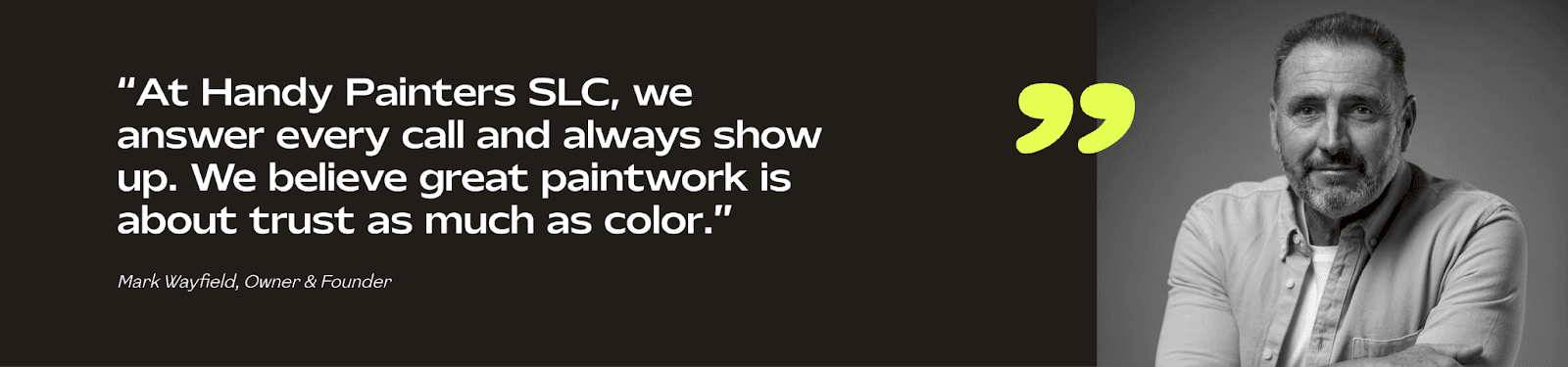
Owner’s Quote Section
Featuring a personal message and photo of the owner adds warmth and authenticity. Use this section to share your mission or reassure potential clients with a confident statement of expertise.
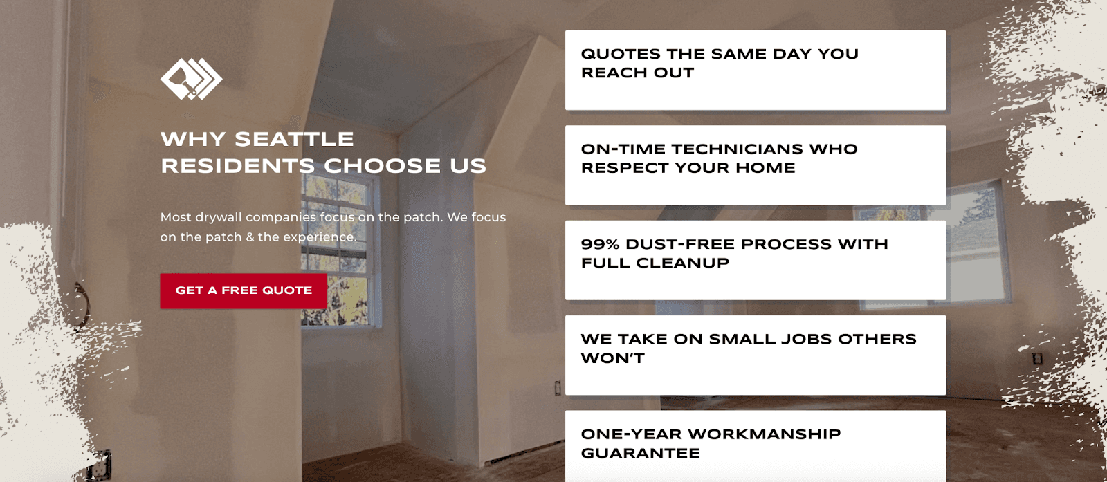
“Why Choose Us” Section
This is your space to differentiate.
Summarize the top reasons clients pick you over competitors – things like turnaround times, guarantees, experience, or customer care. Use icons or mini infographics for visual impact.
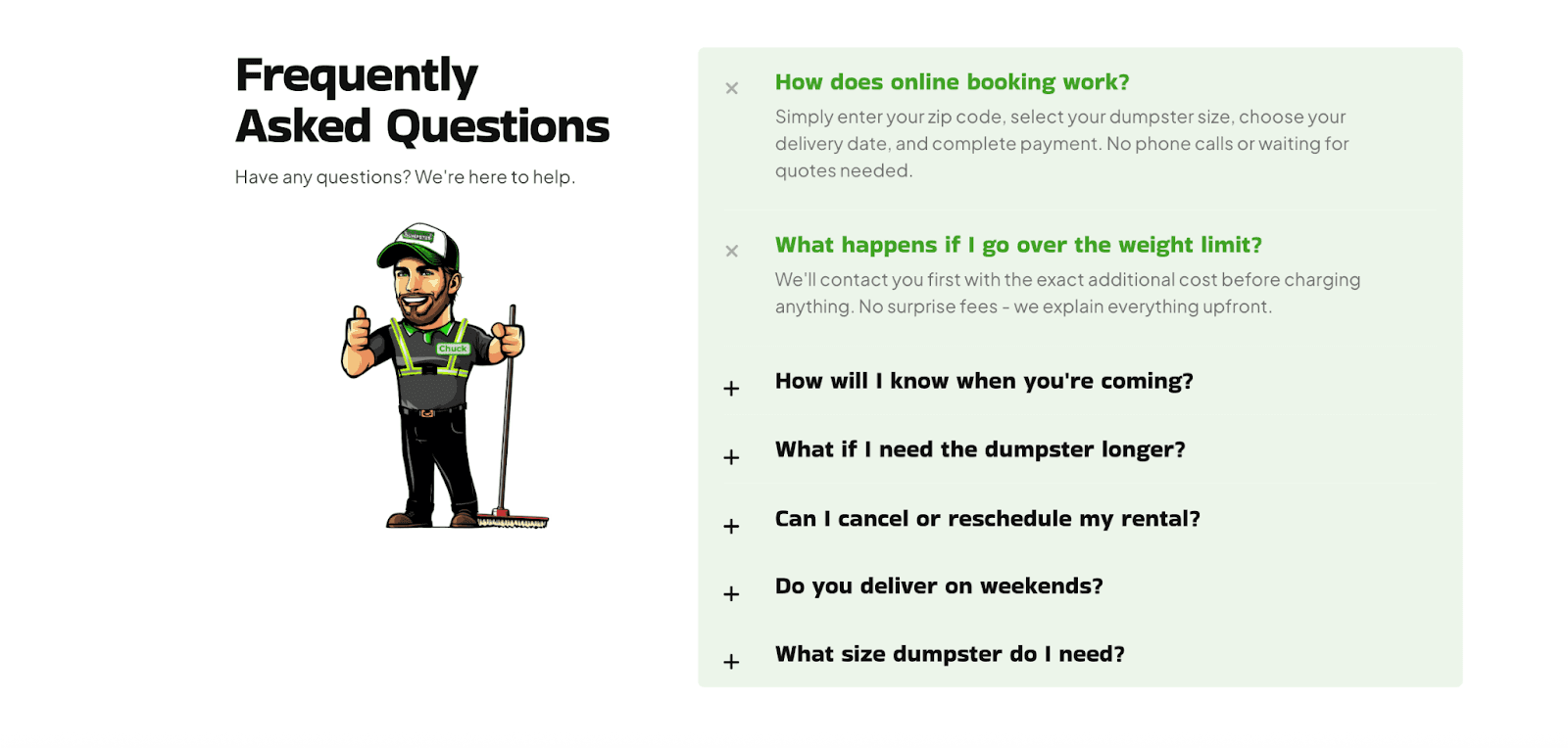
FAQs
End with clarity. Your FAQ section should answer the most common objections or uncertainties customers might have – pricing, process, timelines, warranties, etc.
This section quietly removes the friction that stops visitors from converting but it also plays an important role in SEO.
Search engines often pull FAQ content directly into rich results (featured snippets), increasing your visibility in search. Including targeted keywords and natural phrasing in your questions and answers helps your site rank for the exact queries potential customers are asking.
From a user perspective, FAQs reduce uncertainty and build trust. From an SEO standpoint, they improve relevance, dwell time, and click-through rates – all signals that support higher rankings.
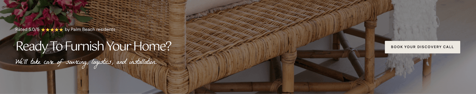
Final Call-to-Action Banner
Close your page with a bold CTA banner – a simple headline, one compelling image, and a clear button (e.g., “Get Your Free Quote” or “Book a Design Consultation”).
By this stage, you’ve built trust and interest – this banner seals the deal.
Final Thoughts
A contractor website that converts isn’t just about great design, but about intentional design.
Every section should have a job to do: your hero draws attention, your process simplifies decision-making, your reviews and badges create instant trust, and your CTAs guide visitors toward action.
When each part is built with clarity and purpose, your site becomes a genuine growth engine.
If you want a team that’s mastered the formula behind high-converting contractor websites, book a free discovery call with Rainmaker Remodel. We’ll walk through your goals and see how we can help you turn clicks into qualified leads.